CD Digipak: Researching Photographic Album Covers
In order from top left to bottom right:
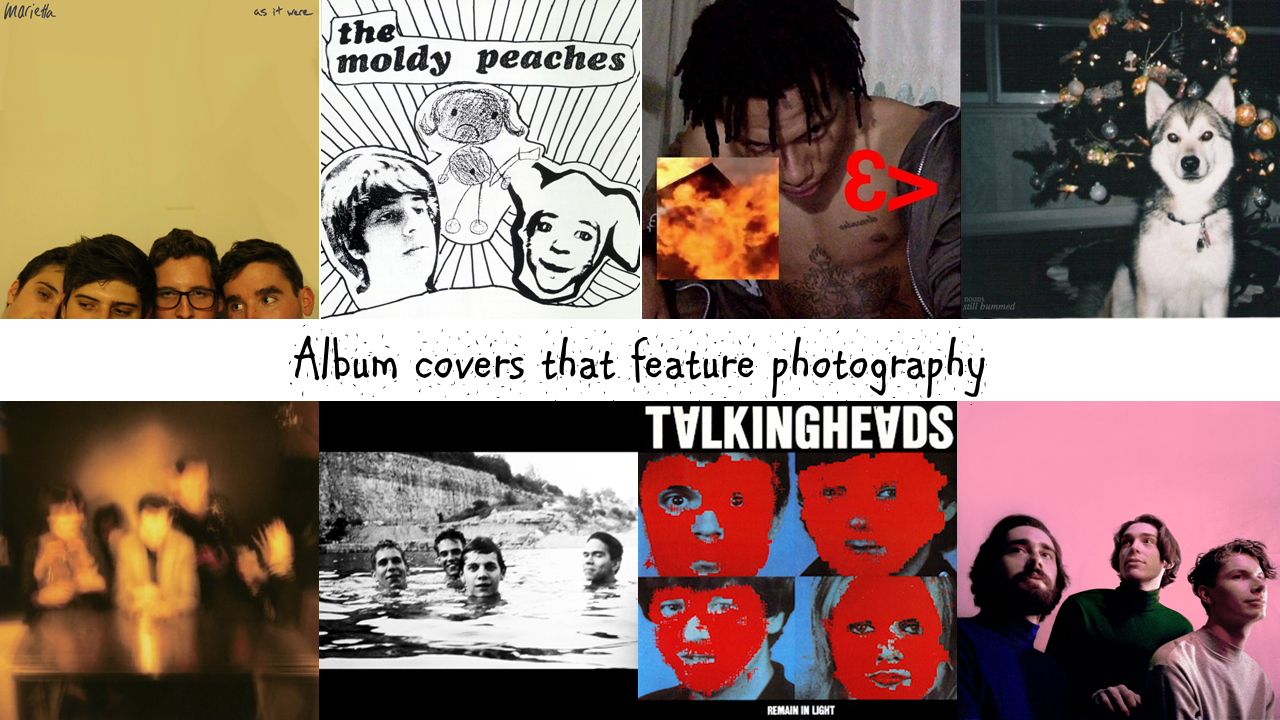
Marietta - As It Were
I like this album cover because of its simplicity! The handwritten text creates a DIY appearance to the cover and so the album instantly feels more personal. I think this is important for an emo band, such as my fictitious band, since the genre is often linked with emotions, nostalgia etc.
The Moldy Peaches - The Moldy Peaches
This album cover is cool because it mixes both photography and drawing. I think that that is somewhat unconventional and is what makes the cover prolific; if i were to adopt this style for my digipak then it would be more unique perhaps. The title of the album/name of the band is located clearly at the top of the cover, in bold text. For me personally, I am likely to not include any text on my cover - however I can acknowledge the choice for clear text, since it allows the consumer/audience to identify the album easily.
Night Lovell - Whoever U Are
Night Lovell's cover design for his single 'Whoever U Are' is intriguing since it features deliberately misplaced images/text. This creates an almost disjointed effect, which I think works really well.
Nouns - Still Bummed
I like this album cover for the fact that the image appears to have been taken on a film camera which creates a personal aesthetic to the cover - it's as if the photo is one that the band found in an old family photo album.
The Horrors - Primary Colours
The Horrors - Primary Colours
I felt that The Horrors' album cover for 'Primary Colours' was cool because it presented the band in a way that wasn't boring; instead of an ordinary portrait, they have incorporated the use of a slow shutter speed to create a "trippy", blurring effect which links to their genre of music.
Slint - Spiderland
Black and white images are always striking due to increased contrast between highlights and shadows. This is no different for the 'Spiderland' album cover. Furthermore, I like the portrait of the band since it is candid and natural - allowing me, as a consumer, to connect more with the band. Shooting in a flooded quarry isn't a standard location and so I think that also gives the cover an edge to it. Additionally, the decision to have negative space at both the top of the cover and bottom is an unconventional decision, since many album covers use images that fill the entirety of the space available.
Talking Heads - Remain In Light
This album cover is simple but effective. It has adopted a standard four-panel approach of presenting a portrait of each memebr of the band. However, what is unique is that each portrait has been 'vandalised' by a red marking. I think that this results in a slightly creepy effect, and certainly makes the album notable. This would also be fairly simple to recreate/adopt ideas from, since it isn't a complex design.
Remo Drive - Greatest Hits
Like the Marietta album cover, this cover is also very simple. There is a significant lack of large text, which means that all of the consumer's attention is focused upon the band. I like how they have decided to use a bold pink colour, instead of an ordinary white back-drop, since it draws attention to the consumer's eye.

Comments
Post a Comment